
Interior House Painting Colours That Work
5/30/20266 min read

A colour card can make every option look easy. Real rooms are less forgiving. Light changes through the day, flooring throws undertones onto the walls, and a shade that looks fresh in a showroom can feel flat or too sharp once it covers an entire living area. That is why choosing interior house painting colours needs to be about more than trends. It needs to work with the way your home is built, used and maintained.
For most Sydney homeowners, the goal is simple. You want rooms that look cleaner, feel more modern and stay presentable under daily wear. The right colour choice helps with all three, but only when it is matched to the room, the light and the level of traffic. A good result is not just about what looks nice on a sample chip. It is about what still looks right six months later.
How to choose interior house painting colours
The best place to start is with fixed elements you are not planning to change. Floors, benchtops, cabinetry, tiles and large furniture all influence how wall colours will read. If your flooring has warm timber tones, a cool grey wall can sometimes feel disconnected. If your kitchen has stone or splashback tiles with beige or cream undertones, a stark white may make them look dated rather than fresh.
This is where many paint decisions go off track. People often choose a colour in isolation instead of considering the full surface mix in the home. In renovation-focused work, the strongest results usually come when the walls support the rest of the space rather than compete with it.
Natural light matters just as much. A south-facing room can make neutral colours appear cooler and flatter. A bright west-facing room may pull more warmth from the same paint and make it feel creamier than expected. Testing samples on more than one wall is worth the effort because the same colour can shift noticeably from morning to afternoon.
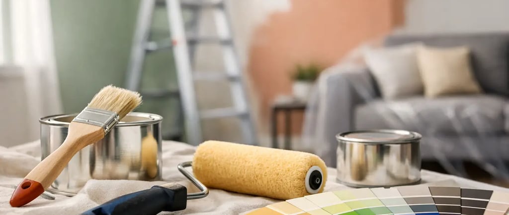
Paint finish also affects how colour reads. Low-sheen and washable finishes are often a practical choice for living spaces because they soften surface variation while still allowing for easier cleaning. In hallways, kids' rooms and other hard-use areas, durability matters just as much as appearance.
The safest colours are not always the best ones
A lot of homeowners lean straight toward plain white because it feels like the safest choice. Sometimes that works. Sometimes it leaves a room looking unfinished or sterile, especially when trim, ceilings and walls all sit too close together without enough contrast.
Soft whites, warm neutrals and light greiges tend to be more forgiving in lived-in spaces. They help walls feel clean and bright without the harshness that some cooler whites can bring. They also sit better with common Sydney home finishes such as oak-look flooring, stone benchtops and off-white cabinetry.
That said, there is no single "best neutral". It depends on the age of the home, the amount of light and whether you want the result to feel crisp, warm or slightly more contemporary. A federation home, a brick veneer family house and a modern apartment all carry colour differently.
Interior house painting colours by room
Living areas usually benefit from colours that stay balanced in changing light. Soft white, putty, light greige and muted beige are reliable because they keep the room open without looking clinical. If the area connects to the kitchen and dining zone, it often makes sense to keep the main wall colour consistent for a cleaner flow.
Bedrooms allow a bit more flexibility. People often sleep better in colours that feel calm rather than bright. Dusty greens, soft blue-greys, warm stone tones and gentle neutrals can work well here. The trade-off is that darker bedroom colours can look stylish and cocooning, but they may reduce the sense of space in smaller rooms.
Kitchens need a practical eye. Wall colours should support cabinetry, splashbacks and benchtops rather than pull attention away from them. In many kitchens, cleaner whites and light neutrals work best because they reflect light and keep the room feeling hygienic and fresh. If cabinetry is being resurfaced or updated, the wall colour should be chosen alongside that finish, not after it.
Bathrooms are similar, but moisture and surface reflection come into play. A colour that looks soft on a plaster wall can look very different beside glossy tiles and mirrors. Warm whites and pale neutrals usually provide the most reliable result. Bold bathroom colours can work, though they need careful balancing or the room can feel busy very quickly.
Hallways and entry areas deserve more attention than they get. These spaces often lack natural light and pick up marks faster than other parts of the house. Mid-light neutrals with durable washable finishes are usually a smart choice because they hide minor wear better than very flat, very pale shades.
Popular colour directions for Sydney homes
Right now, many homeowners are moving away from icy greys and opting for warmer, more settled interiors. That does not mean beige has come back exactly as it was. It means neutrals are becoming softer, earthier and easier to live with.
Warm white remains one of the most requested directions because it works across classic and modern homes. It lifts a room, suits most trims and pairs well with timber, stone and black hardware. Greige is another strong option for people who want a more contemporary look without the chill of older grey palettes.
Muted greens are also proving popular, especially in bedrooms, studies and feature areas. They bring colour into the home without becoming too dominant. The same goes for clay, sand and mushroom tones, which can give a space more character while still feeling practical for resale.
Trend colours are useful as a reference point, but they should never be the main reason for a choice. A colour that photographs well this year may not suit your flooring, your light or the way your family uses the room. Long-term value usually comes from colours that feel settled and well matched, not just current.
Why preparation affects the final colour result
Colour choice gets most of the attention, but preparation has a major impact on how that colour actually looks on the wall. Patchy repairs, uneven surfaces and poor sanding can change the way light hits the paint. Even a quality colour can look average if the substrate underneath is not properly prepared.
This matters most in older homes, where dents, hairline cracks and previous paint build-up often show through fresh coats. It also matters when changing from dark colours to light ones or when repainting surfaces that have picked up stains, scuffs or gloss variation over time.
A professional finish is not just about neat cutting-in. It is about getting the surface right first so the colour reads evenly, the sheen stays consistent and the room feels genuinely refreshed. That is where experienced painters add value. At Azra Painters, the focus is not only on the colour you choose but on the prep and finish that make that choice look right.
Common mistakes to avoid
One common mistake is choosing paint under artificial shop lighting and skipping test patches at home. Another is matching online inspiration too literally. Mobile screens distort colour, and professionally styled rooms rarely reflect everyday lighting conditions.
There is also a tendency to pick one white for everything. In some homes, that works well. In others, a slight shift between ceiling, trim and wall colour creates a cleaner, more finished result. The difference can be subtle, but it helps define the room rather than washing it out.
Finally, avoid picking colours based only on resale fear. Yes, broad appeal matters if you plan to sell, but that does not mean every room has to be lifeless. The better approach is to choose colours with enough personality to feel considered, while keeping the overall palette cohesive and easy to live with.
When a full refresh makes more sense than a single room
Sometimes the issue is not the colour in one room. It is the way several rooms work against each other. A beige hallway leading into a cool grey living area, then into a warm white kitchen, can make the whole home feel disconnected. If that sounds familiar, a broader interior repaint often gives a better result than patching room by room.
A consistent palette can make the house feel bigger, cleaner and more current without major renovation costs. It also helps if you are updating other surfaces at the same time, such as cabinets, benchtops or tiled wet areas. When colours and finishes are planned together, the home feels more intentional.
The right interior colour does not need to be bold to make an impact. It needs to suit the space, wear well and support the way you live. If a room feels dated, heavy or harder to maintain than it should, the answer is often not more decoration. It is a smarter colour choice, applied properly, so the whole home works better every day.